The Bias of World Maps

Maps are human creations, where their effects and the image they portray stay with humans their entire life. As early as elementary school, kids are taught what their planet earth looks like, and unfortunately, the wrong presentation has been accepted for far too long. The issue lies with the fact that people rarely question what they see on a map, as most of the time maps generalize, symbolize, and simplify complex information and relationships.
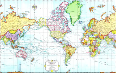
Close your eyes and think about a world map. Most likely, you’ll be picturing the Mercator Projection. This presentation was established in 1569, by Flemish geographer and cartographer Gerardus Mercator. Originally, this was intended solely for ocean navigation until it found its way into western schools. Besides the obvious issue that this representation has been outdated for the past 500 years, it is also very inaccurate, as it does not correctly represent the true size of a country. The project goes on to “distort the size of objects as the latitude increases from the equator to the poles, where the scale becomes infinite”.
The differences are hard to see between what is considered a true projection compared to the Mercator projection, however there are a lot of small factors that play a role. The problem that lies with this projection is the vast exaggeration that comes with these imperialist powers, at the cost of representing developing countries as much smaller than what they really are, ideally depicting them as inferior. For starters, Europe does not lay at the center of the universe, and North America is nowhere that big. This could also attribute to the stereotype that the Northern Hemisphere is associated with wealth and significance, which only gets reiterated when they’re seen as superior on a World map by being bigger and more centered than other countries.
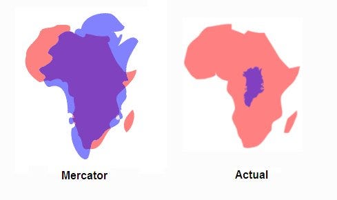
The difference in the Mercator projection can be hard to see. Attatched below is a gif that represents the differences between the Mercator projection and the true size of a country.
Although, Gauss’ Theorem Egregium proved that it is mathematically impossible to translate a sphere onto a 2D plane without creating distortions in either the shape, size, distance or direction of points on that sphere, the Mercator map is especially problematic when teaching children geography. In reality, South America should be twice the size of Europe. Greenland should be 14 times smaller than Africa and three times smaller than Australia, and Alaska appears three times larger than Mexico. These issues, although small and on-print, can actually lead to map bias. Map bias can “deeply affect the way people view the world and their inner sense of “importance.” When one sees their own country as larger, it may warp their views of the significance of other countries”.

courtesy of Bob Lammle, Mental Floss
The next time you see a layout of the world, look further than the basic representation. You’ll understand that its more than just a world-wide representation, rather a symbol of what is considered superior and what is pushed to the side. Pay attention to the size of less wealthy countries like those in Africa, and compare it to those in Europe or North America. Surprisingly enough, you’ll find more bias than expected.
To learn more about the different types of Map Projections, click on “The Wide Range Of World Maps”
To learn more about the history of Maps, past to present, click on “The Brief History of Maps”
